HP
Identity system
Messaging
Digital design
Wayfinding
Environments
Conference
TELLING ONE STORY, A THOUSAND WAYS
Visual and verbal identity, dynamic typeface, a digital and spatial experience for a global leader in technology.
— an award winning brand initiative
In 2011, after three CEO changes, the public was confused about what HP stood for in the marketplace. HP needed to forge a new identity rooted in who they were, powerful enough to convey a single, positive HP experience, internally and externally.
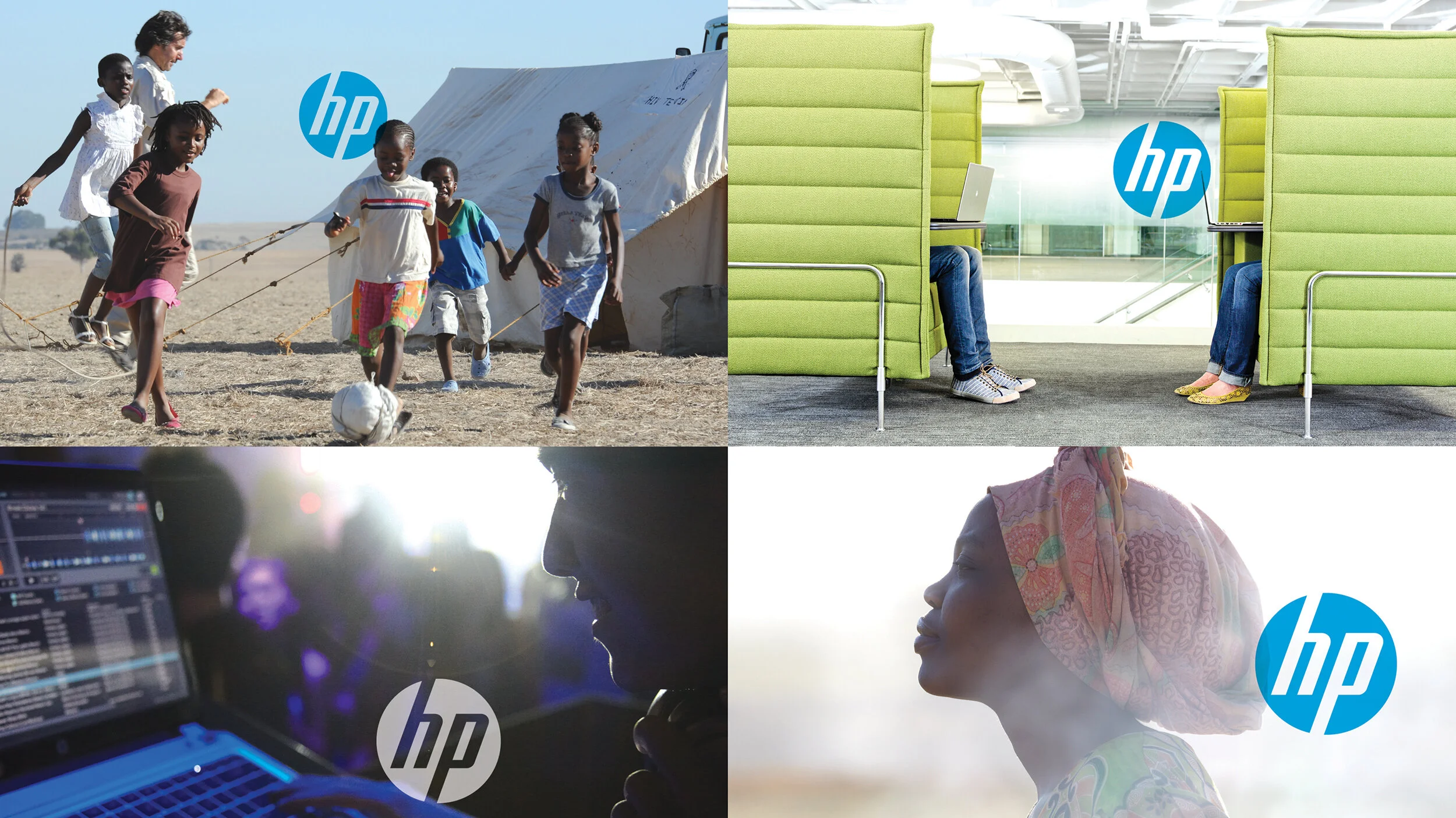
HP’s core ethos was distilled into a single, human story: “HP makes technology work for you, advancing the way we live and work.” This simple shift of focus from the technology HP makes to the people who use it transformed HP’s experience from a fractured technology company to a global partner whose vision, spirit, and sense of connection helps everyone move forward.
In keeping with this simple, people-focused idea, all marks except an updated HP logo were stripped away. The program's focus was to create a clear, bright, and personal experience, where technology advances the way we live and work. This focus comes to life visually by creating a fluid interaction between the logo and image. A clean, bright blue and white color palette, unique, proprietary typeface, and infographic system eliminated the noise of impersonal techno-jargon — inviting collaboration and creativity.
An intranet hub was created for 300,000 employees offering simple tools, easy to use assets, and the training they needed — turning HP’s identity from thousands of disconnected stories into a single story told a thousand ways.
Associate Creative Director, Siegel+Gale


