the Y
Logo and Identity system
Digital design
Wayfinding
Environments
Brand launch
ENERGIZING A CAUSE FOR COMMUNITY
A refreshed brand identity celebrating a vibrant and diverse 170-year-old organization supporting social justice and community-building efforts.
— an award winning brand initiative
Since 1844, the YMCA had long supported social justice and community-building efforts. But as the organization grew increasingly vibrant and diverse over the years, it developed an abundance of identities. Its main organizational message and meaning were obscured — research showed that most people were not aware of the YMCA’s contributions to society and perceived it as just a “swim and gym.” The national Y-USA council decided greater efforts would be needed to overcome widespread misconceptions.
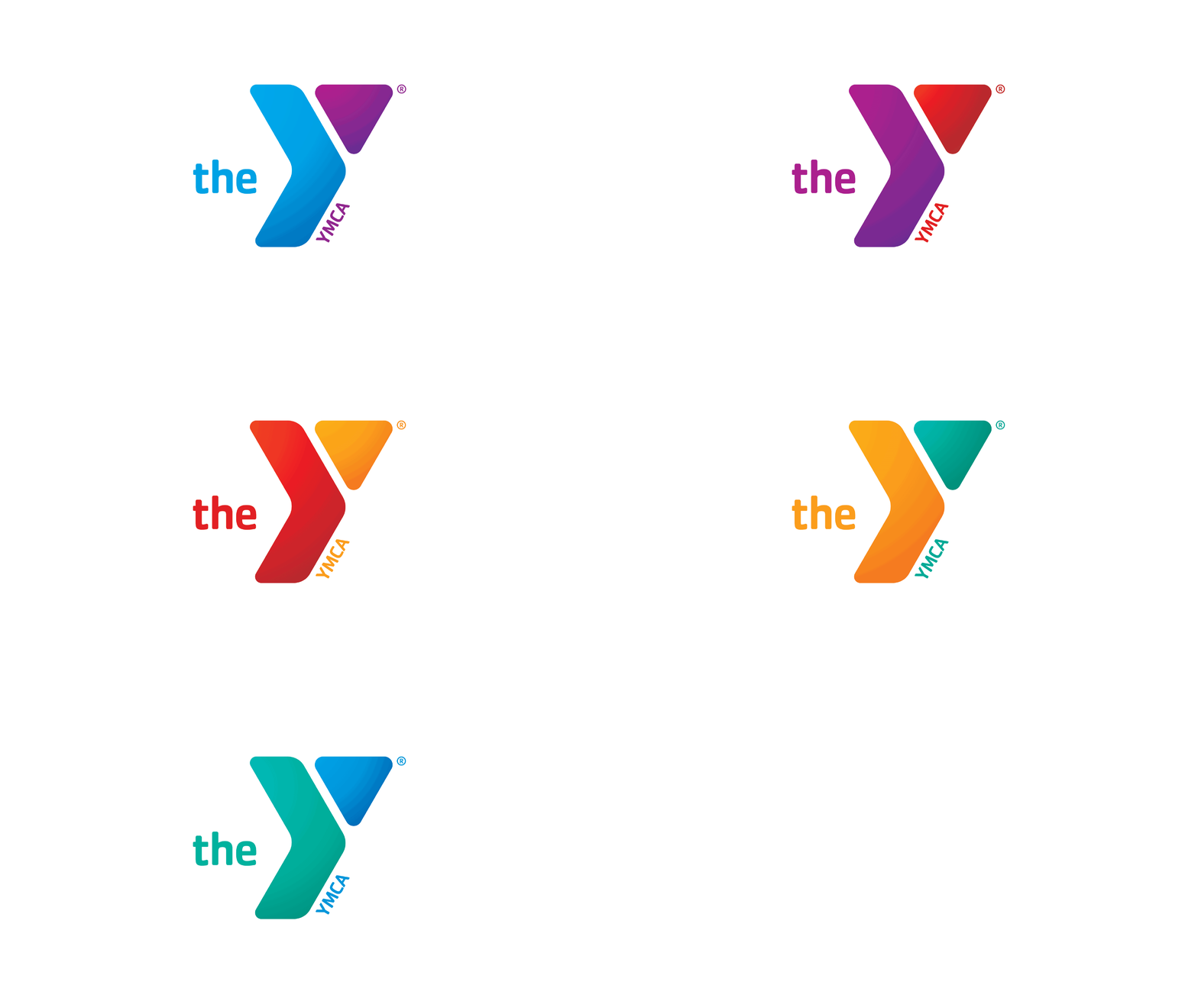
While consulting employees and volunteers, it was discovered that every YMCA was committed to strengthening the foundations of community through three fundamental principles — youth development, healthy living, and social responsibility. Adopting the organization’s nickname, “the Y,” created a friendly, modern sensibility that lent itself to an engaging new visual and verbal identity, including an evolved logo in a range of bright color combinations mirroring the Y’s diversity of programs and audiences.
For the brand rollout, each Y received the tools they needed to launch the new brand in their communities. One month after launch, Y-USA saw a six-fold increase in calls from people looking for their nearest Y. Press coverage of the rebrand reached an estimated 1 billion people, and web traffic increased 25%.
Associate Creative Director, Siegel+Gale


