Ironpeak
Naming
Logo and Identity system
Messaging
Digital design
Brand launch
UNLEASHING INDEPENDENT POTENTIAL
A new name, brand identity, and member digital experience for a network of proudly independent insurance agencies.
The world of insurance is rapidly evolving. The key to navigating this change lies in experience, knowledge, and genuine relationships, which help identify opportunities and support members as they grow. To foster long-term engagement and excitement among members, a new name was created: Ironpeak. This name embodies the organization’s resilience and forward-thinking approach.
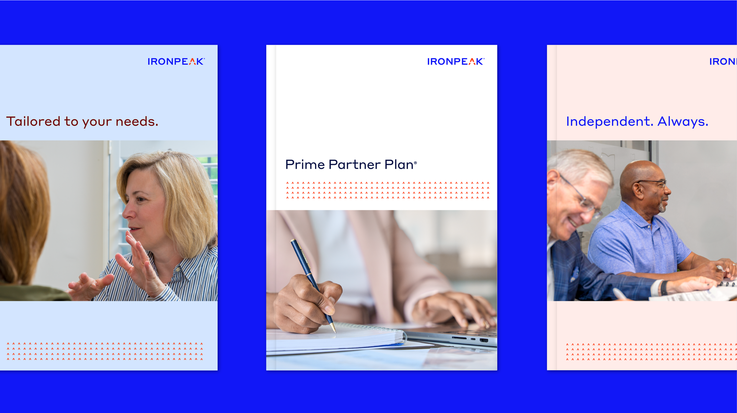
The new branding includes a modern logo, clear messaging, and authentic imagery, all complemented by a unique color palette and graphic elements. This cohesive design aims to create an overall experience that conveys warmth, integrity, and refinement. The logo, a customized wordmark, instills a sense of confidence and aspiration. Its uniquely horizontal sans serif letterforms, combined with a thoughtful use of positive and negative space, tell a distinctive visual story—a spark of shared ingenuity. A unique color palette was intentionally designed to convey four core principles: warmth, honesty, resilience, and resourcefulness. These principles are represented as follows: white tones evoke simplicity and integrity, while the two primary colors—orange-red, symbolizing human ingenuity, and blue, representing confidence and expertise—enhance the visual impact. The vibrant colors emphasize meaningful content, and the use of both the darkest and lightest shades adds depth and sophistication.
Together, these design elements foster a sense of optimism, confidence, and excitement among diverse audiences. Digital tools are utilized to enable, educate, and inspire, allowing audiences to engage with the brand in meaningful and authentic ways.
Creative direction and design in partnership with Matt Huss.


